Case study 01 · Best Buy
Rebuilding Order Details for the way customers actually shop: on their phones.
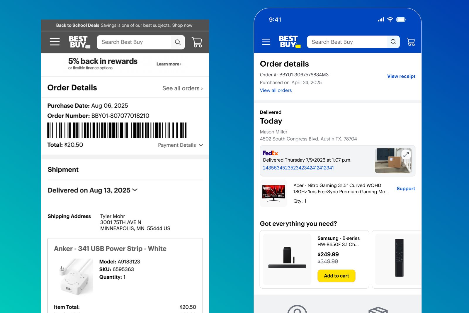
A 10-year-old desktop page, shrunk to small view and wrapped as an app, rebuilt from the ground up as a native, mobile-first experience.
01
The problem
Order Details was built more than 10 years ago for desktop. To reach mobile, the large-view page was slimmed down for small view, then wrapped inside the app. It was never native, and it never felt like it.
Meanwhile, every major retail competitor had modernized. A competitive audit of Target, Home Depot, Walmart and Amazon showed how far behind we were on the basics: clear status, a layout built for phones, and obvious next steps.
Customers
Couldn't find the right self-service option. Many came online for help first and still ended up calling.
Employees
Kept solving the same issues caused by communication failures, often through manual workarounds.
The business
Order status was a top three call driver, and the app's support experience lagged the web.
A close look at the page surfaced four core problems:
- A desktop-first layout that was hard to use on a phone.
- Visually similar pages with different jobs, leaving customers unsure where to go.
- No quick way to tell what was happening with an order, or what to do next.
- Information overload that buried the essentials, with grayed-out buttons where self-service options should have been.
[Image: annotated legacy page showing the four problems]
02
The constraint
This was not a blank canvas. The new page had to support every piece of functionality the legacy page already offered, while rethinking how it looked, worked and was built.
Every decision had two tests: does it make the experience clearer for customers, and does it still cover what the old page did?
It also meant working side by side with engineering as the page moved to a new mobile-first React Native foundation, so the design and the architecture evolved together.
03
Discovery: walking the wall
The first step was laying out the entire current-state journey. In summer 2024, we mapped every fulfillment path across the walls of a room and invited partners across the company to walk the wall.
411
Pieces of feedback captured
8
Fulfillment journeys mapped
6+
Partner teams in the room
Ship to home · In-store pickup · Curbside · Lockers · Gig delivery · Friends or family pickup · Warehouse · Mixed fulfillment
Seeing everything side by side made the disconnects impossible to ignore, from inconsistent status updates to dead ends at the exact moments customers needed help. It also gave a room full of partners one shared picture of the problem, which made alignment on the redesign far easier.
[Photo: Walk the Wall session]
[Image: current-state journey map]
04
Key decisions
Decision 1
Rebuild natively instead of reskinning
Another refresh of the wrapped web page would have repeated the original mistake. We built on a mobile-first React Native foundation, designing for small screens from the start and targeting page loads under 2 seconds.
Decision 2
Start with the happy path, then expand
The first release prioritized ship-to-home orders. A focused scope let us prove the foundation, validate it with an employee-only test, and learn before layering in pickup, marketplace and edge cases.
Decision 3
Lead with status and the next step
The new page puts the right information at the right time: what is happening, when it will arrive, and what the customer can do next, ahead of receipts and order metadata.
Decision 4
Make tracking impossible to miss
Customers wanted delivery windows and map views we couldn't show. Instead of rebuilding them, a simplified, mobile-optimized module hands customers to the carrier with the most complete, actionable information.
Decision 5
Separate first-party and marketplace orders
They run on different ordering systems and financial models, with different support: no seller to contact on one, no support center on the other. Separating them lets each show the right status and the right help.
Decision 6
Design for the unhappy path
Delays, cancellations, split shipments and failed modifications drive the most calls. Instead of grayed-out buttons, the page explains why an action is unavailable and what to do instead.
Decision 7
Good design depends on good data
A clear status is only as good as the data behind it. When carrier updates arrived late or out of order, the page could say "Arriving tomorrow" while the carrier said Thursday. Partnering with engineering on carrier data reliability, like protecting final delivered status and consolidating noisy updates, kept the new design trustworthy.
[Image: sketches to wireframes to final mocks]
[Image: status module across order states]
[Image: unhappy path state, such as a delay]
05
Outcomes and impact
The app version shipped with positive early signals: no harm to guardrail metrics, higher satisfaction scores, and support contacts shifting from phone calls to lower-cost chat.
Simplified tracking, the clearest early proof
26% to 46%
Share of users engaging with tracking after launch
#1
Most-used feature on Order Details
~50%
Lower contact rate for customers who used tracking (4.9% vs 9.9%)
Success was defined up front across four pillars: a mobile-first experience that lowers contact rates, accurate and clear status, value-add moments like reviews that hold steady, and a faster, more reliable page.
06
What's next and what I learned
Small-view web is next, followed by large view. Beyond the happy path, the roadmap expands to pickup, marketplace orders and deeper unhappy path support.
Make the problem visible
Walking the wall turned a decade of accumulated complexity into one picture a whole room could agree on.
Redesign is not reskin
The biggest gains came from rethinking the foundation and the hierarchy, not the visuals.
Trust is end to end
A clear interface can still mislead customers if the data behind it is wrong, so design has to care about the data too.